First Lesson
 In the first media lesson we went through an outline of the course at AS level, looking at the coursework we will produce over the year on filming and editing and video gaming. We also discussed the exams and the skills we would need to practice for the examination.
 In the first media lesson we went through an outline of the course at AS level, looking at the coursework we will produce over the year on filming and editing and video gaming. We also discussed the exams and the skills we would need to practice for the examination.
We started to use connotations and denotations to analyse an advertisement of Calvin Klein perfume. Connotation is the meaning suggested by or associated with a word or thing, denotation is a direct meaning, exactly what you can see. This helped me depict all the details the brand had put into their advertisement that previously I would have missed.
We discussed how the text was in sans serif with "eternity" written across the top of the image to show feminism and to promote the name of the brand.The image is in black and white to represent nostalgia, good memories shared between mother and daughter.The background is of the countryside to represent freedom and escapism, this also broadens their target audience to show any woman can wear the perfume; you do not need to be a certain class.The characters also show heritage, as if this product has been past down through the generations, it's a special keepsake.
Continuity and discontinuity - editing
We looked at some clips where the scene had been edited, we then had to decide whether any mistakes in editing were intentional.
We also started to establish our understanding of some editing techniques - match on action, shot reverse shot and the 180 degree rule. Match on action - one shot cuts to another shot portraying the action of the subject in the first shot. This creates the impression of continuity.
Shot reverse shot- another continuity technique used in conversations or simply when characters look at each other or any objects. It shows what the characters are looking at (point of view or over shoulder shot) followed by a reverse angle shot of the character.
180 degree rule - a filming guideline that participants in a scene should have the same left-right relationship, filming only taking place within the 180 degree angle for a scene involving something like a conversation.
Mise en scene
As a pair Abbie and I analysed the Mise en scene in the John lewis advert. Mise en scene is everything you can see in the frame, the arrangement of scenery.
John Lewis advert - please click on the link
This advert tells the story of one woman's life to link to the John Lewis's logo 'our life long commitment to you'. The location and setting moves through the characters different bedrooms and houses she lives in as she grows.
The advert starts with a modern babies bedroom, to represent the start of a life and a child also represents innocence and vulnerability. It then moves to a child's bedroom with a play area and then a traditional class room, the scenes keep changing from the Uni corridor to her wedding day and finally her home as an older woman with all her family around her. The protagonist dresses in red for every scene except her wedding day, where the colour red is in her bouquet and in her lipstick she wears. This colour can represent death and danger but this advert contradicts this theory because she is a character the audience warm too, this time red represents passion. She stand out from the rest of the cast because she is the only one in a bright colour the other character are in blunt plain colours which make them blend into the background.
The make-up is also very natural to reinforce to the audience that they are real people. The props are all sold at John lewis to advertise their products, they are essential items everyone would use on a day to day basis. The furniture also changes to fit the age range and it also caters for both genders, this advert is specifically for families. The lighting is all very natural, mainly sunlight which is used as a transition between scenes as well. The only contrast in lighting is in the argument scene where natural lighting is replaced with darkness and lightning strikes which symbolises a negative atmosphere and also that there arguing it is a natural part of life, it happens once in a while with families like lightning strikes sometimes. The text at the end of the advert is the same font as John Lewis use for their logo to reinforce the slogan and the company and that their items are for a life time and past down through generations.
Colour symbolism
I learnt how different colours can represent different meanings in media:
Red can symbolises passion and love but it can also be linked to death, blood and danger.
Pink can symbolise love and romance, acceptance and someone who is calm.
Yellow symbolises happiness and optimism but it is also used for deceit and betrayal.
Blue symbolises tranquility and harmony but it is also linked to depression.
Purple symbolises royalty and wisdom but it is linked to cruelty.
Orange symbolises energy and balance but also attention seeking.
Green symbolises nature, health and good luck but it is also portrayed as jealousy and envy.
Brown symbolises stability, reliability and comfort
Black represents power and sophistication as well as evil and sadness.
White represents purity, innocence and death.
Horror - Generic conventions
Horror exists in many genres such as comedy, drama and thriller. Some horror films are dark and gothic and include iconographies such as large country houses and misty graveyards, other locations are mundane, suburban high schools and towns.
Many techniques are used in these films to attempt to scare the audience such as:
- · Atmospheric music and sound, to create the uneasy tone
- · Jump cuts in editing
- · A variety of camera techniques, extreme close-ups to make the audience uncomfortable
- · Low key lighting, to blur the audiences view to hide something from them 'the unkown'
Plots commonly involve the intrusion of an evil force, event or personage. Paranormal activity (2007) uses the devil, which tries to possess the individuals and murder the other characters.
Early horrors often used distant locations for their settings e.g. fairy tales. The Victorian era was a very common setting. Today they are set a lot closer to home, modern horror monsters are school friends or someone the character knows, the familiar surroundings brings the horror closer to the audience. The film Scream (1996) is set in a small American town and involves characters of all different ages including school children.
Horror texts can be seen as metaphors for things perceived as different or outside the normal culture of the audience.
Technical and symbolic codes
A technical code is how the sequence is filmed. They normally start with an establishing shot and use a variety of shot angles with transactions between shots :
- Dissolve - one screen image fades into another
- Fade- the screen gradually disappears
- Wipe- one screen image appears to wipe away another.
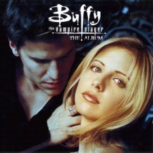
Symbolic codes are things in the shot which represent meaning, including - objects, body language, settings, clothing, colour and sound tracks. We analysed images of Buffy the Vampire and Casino Royale.
Buffy the vampire used black and white clothing and dark lighting to represent the male as a vampire, the black represents death and the girl is presented as very alive and innocent, dressed in white. The male is positioned, with his hand brushing her hair away from her neck which is a stereotypical vampire movement, he is about to bite her neck. It is set in a cemetery, another common place associated with only the dead and spiritual world.
The written codes in this image also conveys a meaning, the serifs font makes it look like blood dripping down and contrasts with the white to represent that Buffy is not a vampire she is still alive. The tail of the 'F' crossing through the line underlining the words represents an upside down cross, which is a sign of the devil. The text also looks like it has been written with a quill and ink to make it seem historic and very old like a vampire is.

Casino Royale has iconography of James Bond holding a gun. He is dressed in a black tux to suggest he is in a formal elegant place. The poker chips and poker table show you he is in a casino, the black and white lighting suggests there are good and bad sides to his character. He protects his country but he also gambles, this is also emphasised with his suspicious expression.
The written codes in this image are very formal compared to those in the image of Buffy the Vampire. The sans serif font makes it presentable and sophisticated which is juxtaposed with the harsh image of the gun at the bottom of the frame, to represent his character. The 007 has been placed in the words, by making the letters bolder and clearer than the rest, another key symbol related to James Bond. They also look like gun shots or two poker chips and the letters are horizontal to represent the speed the bullets move to reinforce the props he has in this image.
Sound
Sound in any film or television programmes, is vital in creating the atmosphere and context of a scene. In media there are two types of sound, diegetic and non-diegetic.
Diegetic sound is any sound that's source is visible in the scene:
Sound in any film or television programmes, is vital in creating the atmosphere and context of a scene. In media there are two types of sound, diegetic and non-diegetic.
Diegetic sound is any sound that's source is visible in the scene:
- the characters voices
- sounds made by objects in the frame
Non-diegetic sound is coming from a source outside the space:
- background music to create the atmosphere
- doors closing from outside the frame
Music helps with the emotion of a scene, each genre plays different music. A horror film uses music with a contrast in pitch, pace and volume, whereas a romantic comedy uses music which is very major with a constant volume and smooth speed.
The music in films can either be contrapuntal or parallel. Contrapuntal is music conflicting with the image whereas parallel music fits with the image. Different language in a scene can also change the way it comes across to the audience. Accent, tone and vocabulary all create different connotations, for example someone shouting shows aggression whereas silent scenes are used mainly in horror films to create tension.
The music in films can either be contrapuntal or parallel. Contrapuntal is music conflicting with the image whereas parallel music fits with the image. Different language in a scene can also change the way it comes across to the audience. Accent, tone and vocabulary all create different connotations, for example someone shouting shows aggression whereas silent scenes are used mainly in horror films to create tension.
Ideology
Ideology means a system of beliefs that are constructed and presented in media texts. We used this skill when looking at images of the world flags.
Ideology means a system of beliefs that are constructed and presented in media texts. We used this skill when looking at images of the world flags.

· A capitalist nation
· Patriotic
· Pride
· Determination
· Liberation
· Freedom
The Chinese flag is presented as

· Oppressed
· Intelligent, good education system
· Poor underclass
· Ancient civilisation
· Large economy
We also looked at images of American soldiers and fire men placing the American flag in the ground in big historical events such as World War II and 911. The flag was a sign of strength and courage. Its iconic colour scheme stood out on the page to show the pride the country has for its country and the strong team they built.
Ideologies are presented in all aspects of media. Many magazines, like Vogue create an image of the ‘ideal’ woman that every lady should aspire to be - thin and pretty. You are given the impression that if you are the ideal lady you will be wealthy and happy.
Camera shots analysis
We have looked at camera angles and shots in different types of media and looked at the effect this can make on an image.
We took pictures of our own versions of each shot, i have then compared it with shots i have found:


 This is an example of a establishing shot - A long shot, often the first in a sequence, which establishes the positions of elements relative to each other and identifies the setting. The one we took establishes the scene in part of the school building, where as the Golden Gate bridge shot shows you the entire city it is a bigger scale and is also taken at night so the lighting off the bridge creates shadows on the water to make it glisten whereas our photo has just natural lighting with just the shadows from the buildings reflected on the ground, the buildings and trees create a pathway, where you can see far into the distance after this shot the camera could zoom into the pathway.

This is a point of view shot - a shot which is understood to be seen from the point of view of a character within the scene. It is a way of showing a scene from a character perspective. Our image shows the school building again whereas the one i found is someone on a bike and the frame of the bike can be seen on a busy road, the lighting from cars and buildings look blurred to represent the speed the bike is moving at, everything in our photo is in focus to show the audience the character is still and just pointing to the building.

 This is a extreme close up shot - it reveals the small details in the scene. It might be used to reveal fear in a subject in a horror or a detail a detective picks up in a mystery. This image makes George look very sinister, with the dark lighting and frowning expression where as the other image creates a completely different atmosphere, this image is a extreme close up at eye-level, the connotations of the very pale skin and piercing blue eyes represents innocence. This character looks very vulnerable even though we can see no facial expressions or any other part of the body. The delicate eyelashes show female attributes which make it likely that this is a lady.
 This is a close up shot - the head and shoulders of a subject, used to reveal details of a characters face. The two images create completely different atmospheres, our image is very relaxed with bright natural light and Toby looks happy, the image from The Terminator has very dark lighting to create shadows on his face and his sinister expression makes him look very intimidating and the villain in the scene.
 This is an over the shoulder shot - which reveals one subject as seen from over the shoulder of another subject. It stimulates a view seen from the seconds persons eyes. It is often used in conversations where the directer focuses on the person talking or a close up of the other persons reaction. The image we took is very relaxed and both characters look happy where as the image from the Terminator is very tense the woman looks scared of the robot and also shocked that he is still alive after being shot. She is also at a lower level then him, she is weaker whereas out image has both boys at the same level, they are equally in control.
 This is a two shot - Two people in the scene and their interaction is important. It is a good way to introduce a conversation. The photo we took looks like bullying, one boy making fun of the other this is reinforced from the door framing surrounding them, which reinforces the idea he is trapped. The two shot from the 'Shining' is very sinister and also shows the two different emotions, one twin is smiling whilst the other one is frowning.
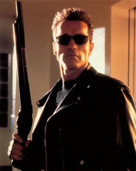

This is a medium shot - it is from just below the waist to above the head. The image we took is very formal the suit he wears and the building makes him look authoritative and wealthy. The image of the Terminator has authority but because of the gun he has in his hand, which makes him look very intimidating. The leather jacket and black sunglasses make him look very strong and powerful.

 This is a medium long shot - a shot where a large object fits into the frame, you can still see expression on their face whilst seeing the setting surrounding them too. Our image is very relaxed and Toby looks formal and intelligent. The image from The Terminator looks very dangerous, the flames in the background symbolise fear and danger the metal figure walking towards the camera is also very intimidating , he looks dangerous.
 The long shot fits a large object completely in the frame. The image we took now allows the audience to see his full figure, we can also see a shadow on the floor to symbolise part of his character he is hiding from the viewer. The woman looks very strong, this shot allows us to see her muscles and the gun she is holding which give her power and creates a very intimidating character.

This is an extra long shot - it gives the viewer a prospective as to where the subject is. It is used when a subject is moving to a new location. The photo we took makes the character look isolated from the doors that create barriers around him. The other image also creates this idea with the bars surrounding her, she is also looking away from the camera to tell the audience they both want to escape.
 Media conference
Social networking gave the media a bigger scale to publish on in the last couple of years, it let other people share their opinions. The media tends to put a frame around a specific topic and focuses its attention on it, which means it ignores other explanations that could be the course of the problem.
The exam boards gave us advice for the exams, 3 key words were:
Text- the complex narrative like in Doctor Who with its remaining iconography of the tardis and the appeal of characters.
Audience- the loyal and passionate fans that use popular shows, as a way of escapism and for social interaction, it is something to discuss.
Industry- who creates the programme, Doctor Who is made by the BBC who have a high reputation for well made programmes with respected script writers. They schedule the programmes to fit with the target audience.
Pete Fraser the chief examiner gave us help for our film making, he gave us key words to remember when doing the particle part of the course :
- research
- planning
- evidence
- ideas
- get feedback
- logistics
 equipment
 - production
- reflection

We also got an insight into directing when Garth Jenning did a speech on his career, his most famous films were Son of Rambow (2007) and The Hitchhiker's guide to the galaxy(2005), he showed us clips of them making the films and told us how he got into the industry.